Building simulation
The Building Simulation module contains various results. In addition to the graphs shown below, several tables are available, and a complete Word report is generated. It is also possible to customize your tables. This allows you to view additional information, such as floor temperature and radiation asymmetry. All tables can be displayed in 3D and have the capability to be exported to Excel.
Click ![]() to display the values from a clickable column in color on the geometry.
to display the values from a clickable column in color on the geometry.
Click ![]() to export a table or the values from a graph to Excel.
to export a table or the values from a graph to Excel.
Click ![]() to export a graph to a .png.
to export a graph to a .png.
Energy statistics

The energy statistics table shows the energy demand at both the total level and per room; since the total may occur on a different date than per room, this is not simply an addition.
Room state
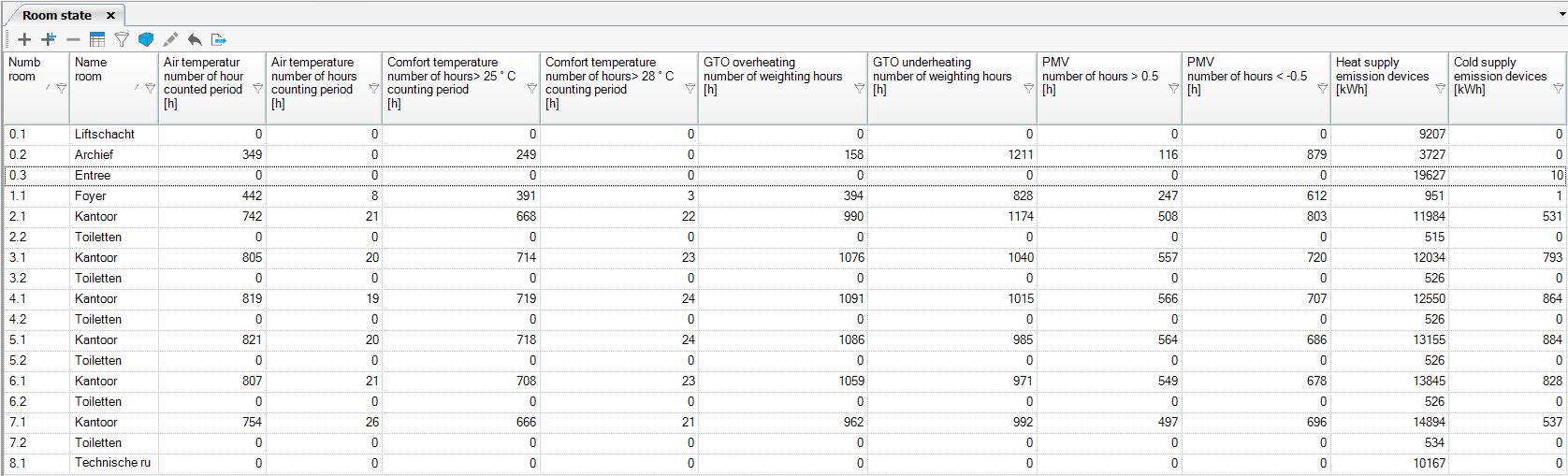
The room state table is a generically designed table in which various outcomes are visible per room.
Watch the webinar below on reducing GTO under- and overruns
Temperature Statistics
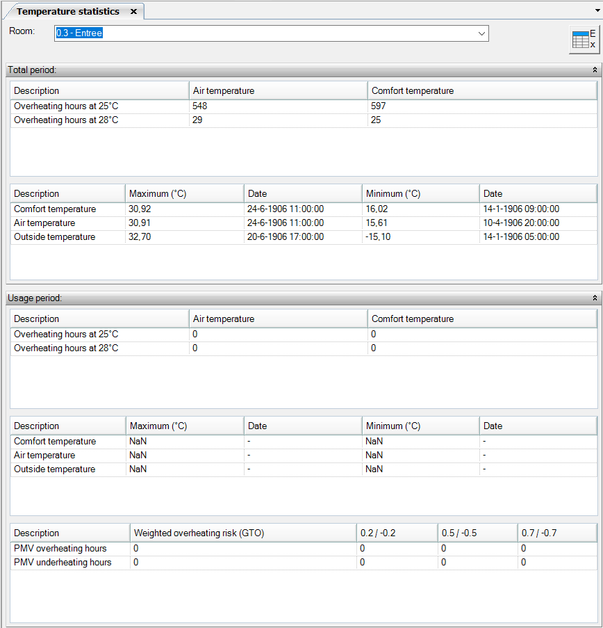
The table of temperature statistics shows results related to comfort calculations and temperature.
Energy need Profile
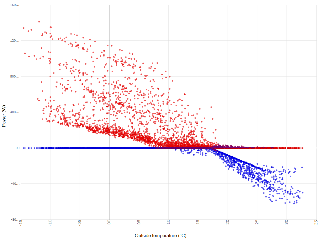
The energy need profile is a graphical representation of the required power plotted against the occurring outdoor temperature. The red points correspond to heating and the blue points to cooling. The points that appear purple are moments when both heating and cooling are provided. The lowest value of both is taken into account for determining the value that is mentioned in waste, and therefore also displayed as purple (red and blue points that overlap).
Period
Here you specify the period over which you want to display the need profile:
- The Total period applies to the entire period over which you have calculated. This period is defined under the selection of the Climate file.
- The Operating Hours apply to the total period during which the building is in use. This period is determined from the calculation period. Defined in the Climate file, and the Time Schedule use linked to the spaces, viewed over the entire building.
Publication
Heating and cooling lines for other installation concepts
Load duration curve
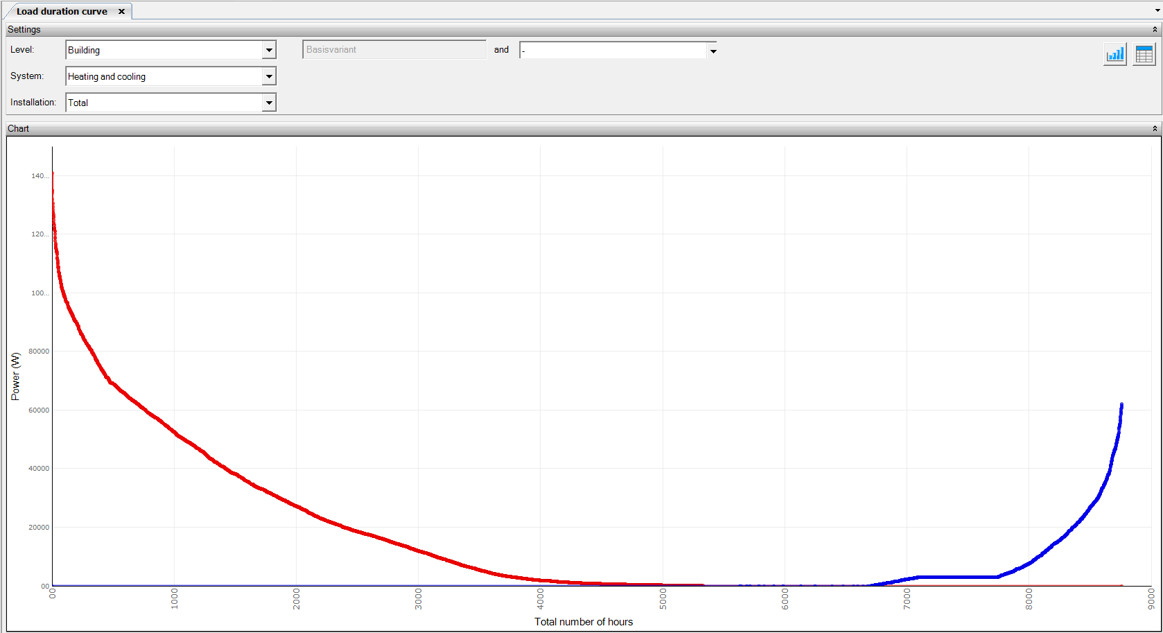
The load duration curve is the power (W) sorted in order of decreasing size against the number of hours that the power occurs. The area under the graph is the number of kWh. With the self-adjustable maximum and minimum power limits, you can directly see what percentage of the time you have sufficient power and how many kWh you consume within these limits.
System
Here you choose which type of generator you want to show the load duration curve for:
- Cooling: This concerns a blue line and represents the required cooling capacity.
- Heating: This concerns a red line and represents the required heating capacity.
- Both: Both the capacities for heating and cooling become visible.
Level
Here you specify whether you want to view the load duration curve of the entire building, of the air treatment, or whether you want to view the load duration curve of a specific space.
Minimum / Maximum power limit
With this tool, you can manually determine a minimum or maximum limit where you determine the applied power of the generator. Based on the specified limits, the consumption of the different parts of the graph is also displayed.
Publicatie
Load duration curve
Variant Display
Here you have the option to display a graph of any other calculated variant alongside the active Variants. The active variant is displayed with a bright blue (cooling) or red (heating) line. The other displayed variant is shown in a lighter blue or red color. The line of the active variant will be displayed in the foreground. When a part of the line of the variants is in the same place, the bright color will be displayed over the lighter color.
Comfort charts
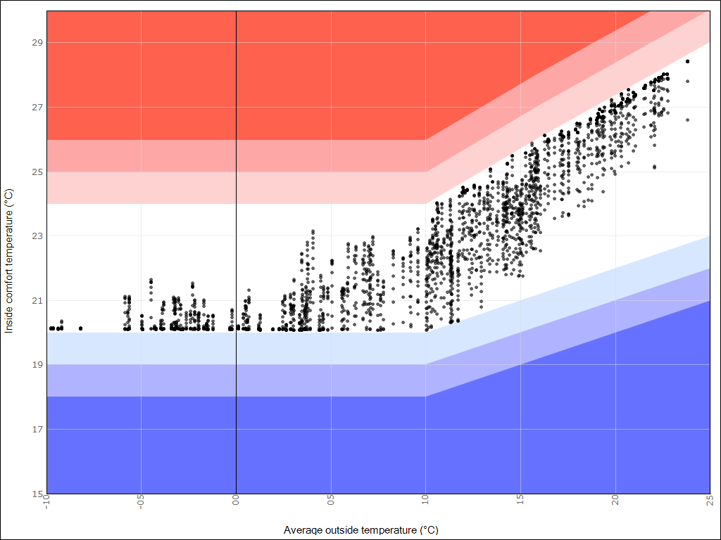
In a comfort chart, all comfort points are displayed as a function of a weighted outdoor air temperature; weighted over the instantaneous daily average on the respective day and the seven days before it.
The most commonly used comfort chart is the ATG chart. In addition, there is a comfort chart available for Frisse Scholen 2015 or 2021 and NEN-EN 15251. This indicator is intended as a replacement for the GTO method; the PMV method remains usable for situations with an exceptionally high metabolism or clothing resistance. The ATG is in principle suitable for buildings with a lot or little user influence, with windows that can be opened or completely closed facades.
For more information on the ATG methodology, see our publications on Productivity and Absenteeism and Sliding Setpoint using the ATG Methodology.
Other comfort charts that can be used include the comfort chart from NEN-EN 15251 and the comfort chart for Frisse Scholen 2015 or 2021.
Period
Here you specify the period over which you want to display the comfort chart:
- The Counting Hours apply to the total period during which the hours need to be counted. This period is taken from the specified counting period. Determined in the Climate file, and the Time Schedule counting hours linked to the spaces.
- The Total Calculated Period applies to the entire period over which you have calculated. This period is defined under the selection of the Climate file.
Temprature
Here you specify which temperatures the program should show in the Comfort chart.
- Comfort temperature (operative temperature). The local devices are regulated at comfort temperature. The results of this can be viewed with this option;
- Air temperature. The air treatment is regulated based on air temperature. The results of this can be viewed with this option.
Room
Here you specify which room’s Comfort Chart you want to view. You can only view the chart for one room at a time
Calculation methods
Here you specify which Comfort Chart you want to view.
- ATG ISSO 74: This option displays the ATG chart
- NEN-EN 15251: This option displays the NEN-EN 15251 chart
- Frisse scholen 2021: This option displays the chart as defined in Frisse scholen 2021
- Frisse scholen 2015: This option displays the chart as defined in Frisse scholen 2015
Publication
Class type
Here you indicate whether the Comfort Chart should be displayed in alpha or beta, according to the flowchart from ISSO 74, figure 3.5. This is determined, among other things, by opening windows.
Alpha: Building/climate type Alpha
Beta: Building/climate type Beta
For Frisse scholen, you indicate:
Alpha: for a building with passive cooling
Beta: for a building with visible active cooling
Display of Variants
Here you have the option to display a chart of any other calculated variant alongside the active Variants. The active variant is displayed with black dots. The other displayed variant is shown with green dots. The dots of the active variant will be displayed in the foreground. When a black and green dot are in the same place, the black dot will be displayed over the green one.
Results Table
This table is constructed from the following columns:
- Description: This displays the relevant class, Class A, B, C, or D;
- Undershoots: This column shows the number of undershoot hours;
- Exceedances: This column shows the number of exceedance hours;
- Total: This column shows the total number of hours (undershoot hours + exceedance hours);
% of hours: This column shows the percentage of the set Period in which undershoots + exceedances occur; - Complies (with RGD): This checks whether it meets the requirements of Fresh Schools (maximum 5% of hours) or the RGD (maximum 1% of hours). As for NEN-EN 15251, there are no standard requirements.
Daily results charts
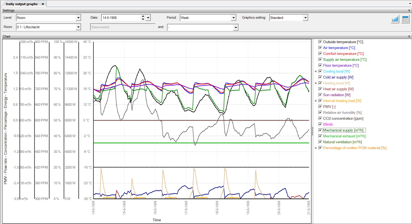
The daily result charts show the temperatures that have occurred for the various climate components over a certain period. This period can be a day, a week, a month, or a year.
Level
Here you specify at which level you want to view the effects.
- Space: where you can view the local effects;
- Distribution: where you can view various temperatures per distribution network: outside temperature, water temperature, desired water temperature, and water return temperature.
- Air Handling: where you can view the central effects per air handling unit;
- Building: where you can centrally view the effects of the entire building. When viewing multiple spaces, you can compare the results of different spaces and have an additional choice of central data.
Variant Display
Here you have the option to display a chart of any other calculated variant alongside the active Variants. The active variant is displayed with a solid line. The other displayed variant is shown with a dotted line. The line of the active variant will be displayed in the foreground. When a section of the variant lines is in the same place, the solid line will be displayed over the dotted line.
Chart Setting
Here you have the option to choose standard or compare. If compare is chosen, depending on the selected level: spaces, distribution networks, or air handling units can be compared per item to be chosen.
Results on Room Level
When the Level is selected, the following results are available:
- Outdoor temperature [°C]
- Air temperature [°C]: this is the dry bulb temperature;
- Comfort temperature [°C]: the comfort temperature consists of a ratio between the air temperature (56.5%) and the radiation temperature (43.5%) in a space;
- Supply air temperature [°C]
- Floor temperature [°C]
- Local cooling [W]: this is the hydronic delivered power (can still be distributed per device);
- Cooling delivery supply [W]: this is the power delivered by the supply air due to the difference between the room temperature and the supply air temperature;
- Local heating [W]: this is the hydronic delivered power (can still be distributed per device);
- Heat delivery supply [W]: this is the power delivered by the supply air due to the difference between the room temperature and the supply air temperature;
- Solar radiation [W]: this is the net solar radiation, so the amount that comes from outside to inside minus the amount that disappears to another space or outside due to transmission;
- Internal heat load [W]: this is the sensible delivered power (can still be distributed per IWP: people, equipment, lighting);
- PMV [-]
- Relative humidity [%]: this is the relative humidity in the space;
- CO2 concentration [PPM]: this is the CO2 concentration in the space. The CO2 concentration of outdoor air is 390 PPM and for the CO2 production of the present persons, a calculation of 4.18601 E-08 m³/s per W metabolism is used, see this CO2 article for more information.;
- Sunscreen: here it is indicated whether the sunscreen is open or closed;
- Mechanical supply [m³/h]: this is the mechanical supply air quantity in the space;
- Mechanical exhaust [m³/h]: this is the mechanical exhaust air quantity in the space;
- Natural ventilation [m³/h]: this is the natural supply air quantity in the space.
- Percentage of melted PCM material [%]: this indicates what percentage of the used pcm materials have melted. Here you will also find the heat release and absorption in W of the PCM materials.
Results at Distribution Level
When the Level is selected, the following results are available:
- Outdoor temperature [°C]
- Water temperature [°C]
- Desired water temperature [°C]
- Water return temperature [°C]
Results at Air Handling Level
When the Level is selected, the following results are available:
- Outdoor temperature [°C]
- Supply air temperature [°C]
- Desired supply air temperature [°C]
- Return air temperature [°C]: this is the average temperature of the return air from the various spaces connected to this air handling unit, this average is proportional to the amount of air per space, this temperature includes warming from the fan;
- Total heating energy requirement [W]: this is the hydronic delivered power, sensible and latent combined;
- Total cooling energy requirement [W]: this is the hydronic delivered power, sensible and latent combined;
- Total fan energy [W]: this is a sum of the power of the supply and exhaust fans;
- Absolute humidity before AHU [g/kg]
- Absolute humidity after AHU [g/kg]
- Mechanical supply [m³/h]
- Mechanical exhaust [m³/h]
Results at Building Level
When the Level is selected, the following results are available:
- Outdoor temperature [°C]
- Total cooling delivery [W]: this can be subdivided into central cooling delivery and local cooling delivery. The central power refers to the power that needs to be delivered from the central generator to the cooling coil of the air handling unit;
- Total heat delivery [W]: this can be subdivided into central heat delivery and local heat delivery.
- Solar energy generated [W]: The energy generated by the panels is displayed on average per hour.
Temperature frequenty
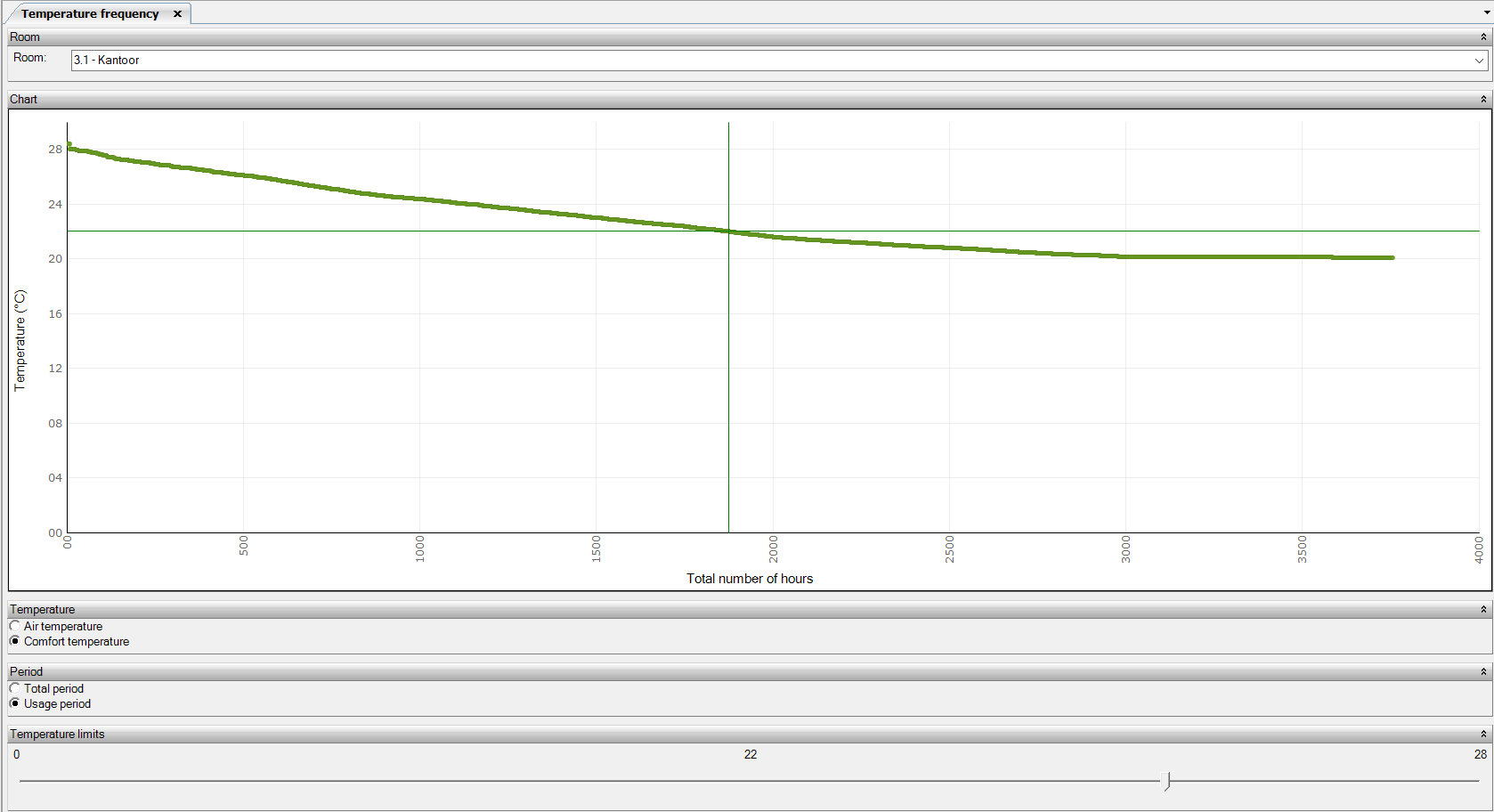
A temperature frequency distribution is a chart that arranges the hourly indoor temperatures that have occurred over a year by the number of hours.
Reading example: For x number of hours, the indoor temperature is above y °C.
Productivity
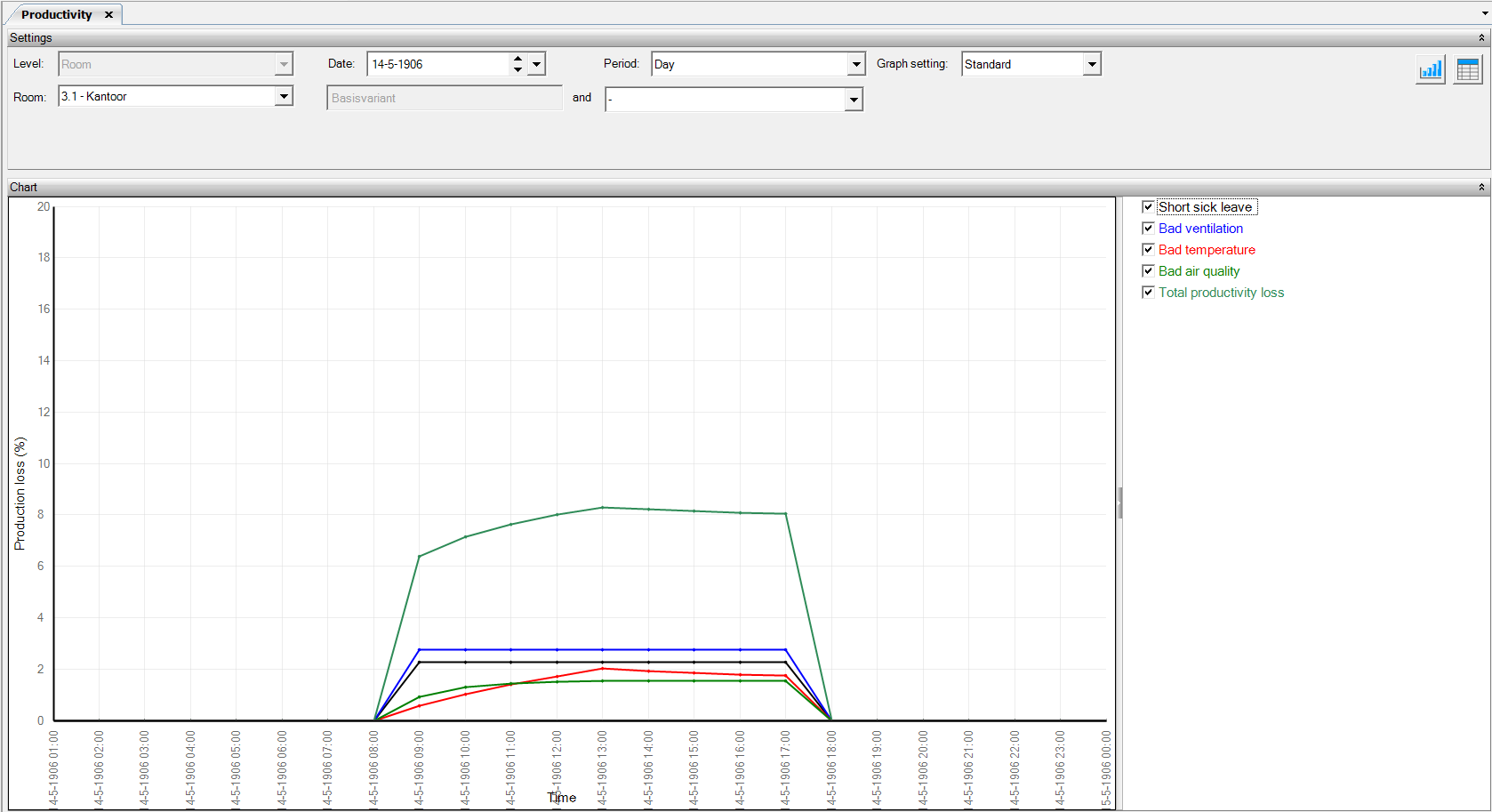
This chart shows the productivity losses due to ventilation, temperature, and air quality. A better indoor climate results in better health and increased productivity. These results could be included in the economic calculations of the building.
The indoor environment in offices strongly influences the health and productivity of the people working there. Thus, an improved indoor environment results in better health and increased productivity. The cost savings this entails were generally not included in economic calculations for building design and management. Often, these calculations are limited to the total construction, energy, and maintenance costs.
Therefore, the climate installation not only affects building costs but also indirectly affects productivity and ultimately revenue.
In short, there is a need for means to integrate the economic health and productivity outcomes into the cost-benefit calculations along with the construction, energy, and maintenance costs.
Publication
Chapter 7, Calculationprocedure
MS Word Reporting - Flexible (from 3.8)
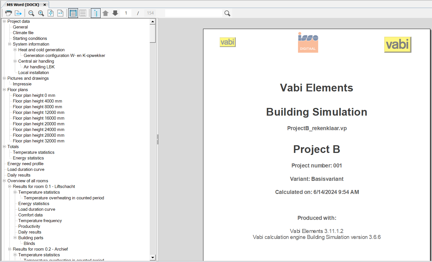
The Word report contains all the detailed information about the project. It includes, for example, the principles, totals, and a detailed printout at the room and building level of the results. The name of the variant is also printed. Furthermore, various charts are included in the report, which have already been explained above.
"Complete report / abbreviated report"
It is possible to opt for an abbreviated report that displays the most important data. This option is only available if flexible reporting is unchecked (project data, project settings) or if you are working in a version older than 3.8.
You can print the report. When you click the button, a Windows Print dialog box will appear where you can select the printer to which you want to print the report.
Export to MS Word (RTF)
Window where you can specify the location to save the report.
The file name is automatically generated as: Report_{yyyyMMdd}_{HHmmss}.rtf, where the variables y, M, d, H, m, and s represent the date and time of the calculation. This RTF file can then be opened in Word or another word processor.
Once the RTF report is opened in Microsoft Word, you can modify it as needed.
Zoom in / Zoom out / Zoom to page / Zoom to page width
With these buttons, you can zoom in and out on the report. You can also zoom to display one page fullscreen (Zoom to page). The final zoom option is to zoom in such that the width of the page fits exactly within the screen (Zoom to page width).
View
In addition to viewing per page, it’s possible to choose normal view, where the entire report is displayed continuously.
Navigation
This allows you to display or hide the navigation tree on the left side.
Previous page / Next page / Enter page number
Using the Previous page and Next page buttons allows you to navigate through the report. You can also directly enter a page number to view the specific page you want.
Search
By entering a search term, the document is searched, and the results are displayed one by one.
Images
New in the Building Simulation Report is the ability to add an unlimited number of images. You can add images to the report yourself by adding them to Project Data. You can also save a 3D image in the geometry that you can find under Photos and Drawings. Floor plans are automatically added to the report.
The placement of an image in the report depends on its type (Cover/Page plan/Image/Impression).
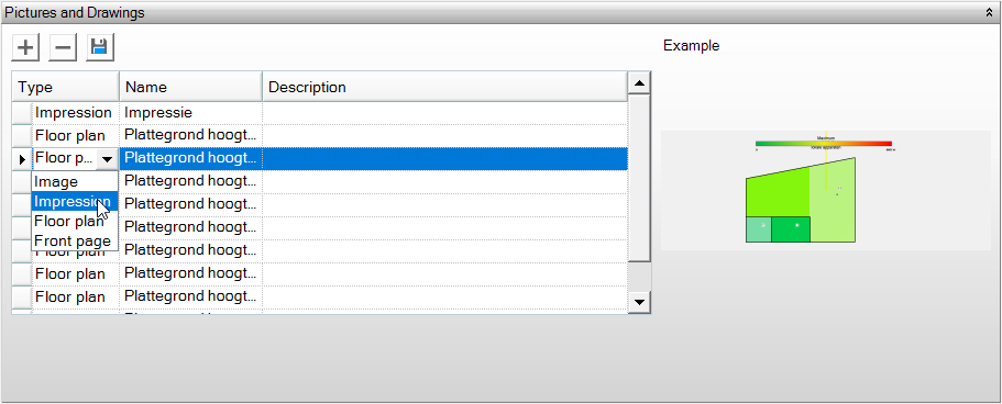
The first image under Project Data with the type “Cover” is used for the cover page of the report.
All images with the type “Image” are included in the report.
In the Building Simulation Report, floor plans are automatically added. You do not need to generate them using the floor plan button. This button remains available for other reports until they are updated.
All images generated with the “Save Floor Plans” button automatically receive the type “Floor Plan”. These are not included in the report because floor plans are automatically generated during calculations. If you want to add these floor plans to the report, you need to change their type to “Image”.
Floor plans generated during airflow visualization (Ventilation Flows GS) are included in the report.
Impressions are not included in the report. If you want to include them, change their type to “Image”.
MS Word settings
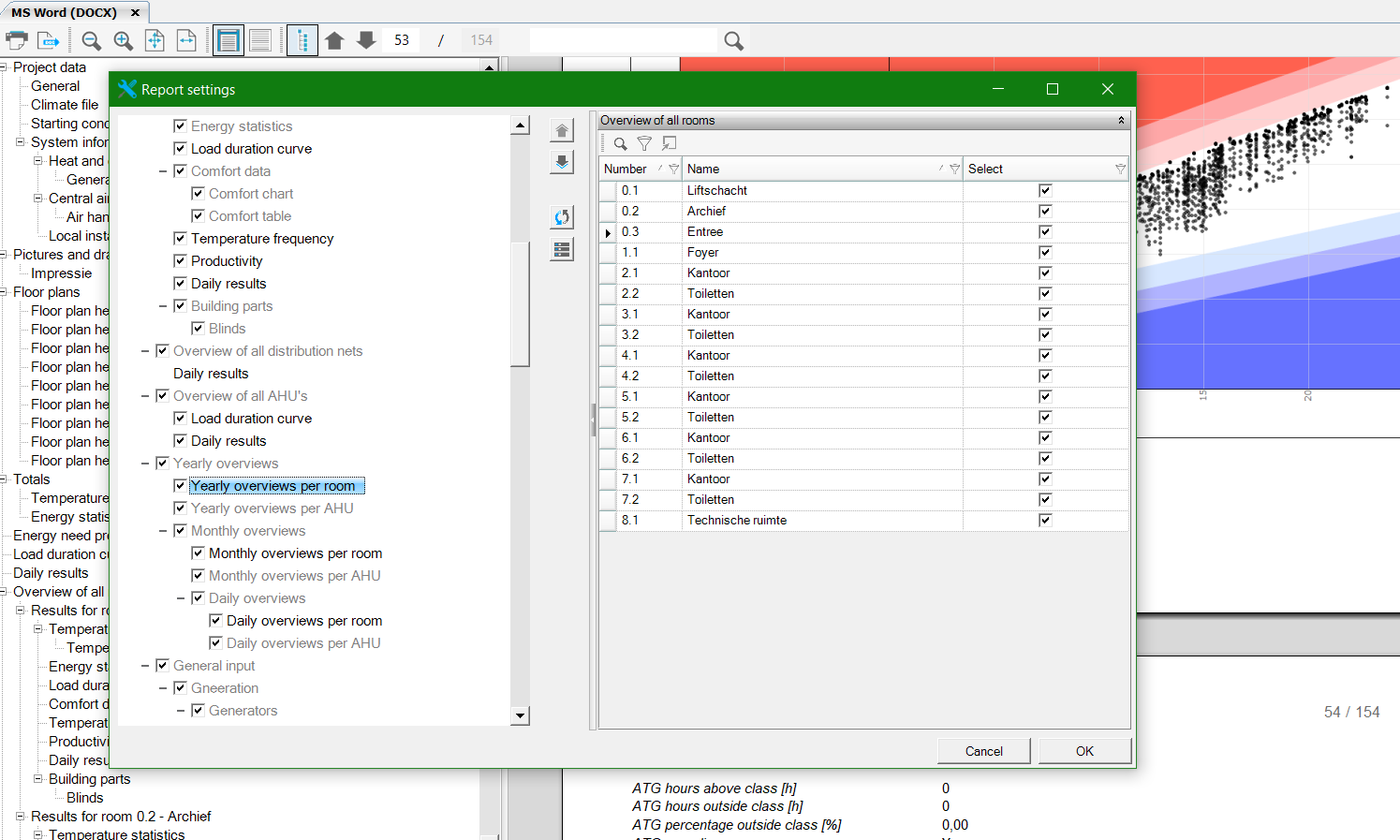
With the settings function, you can change the order in the report, enable or disable chapters, toggle rooms on and off. You can also choose whether to include graphs in the report and customize them as needed. After adjusting the settings, calculations need to be rerun.
Text report (TXT)
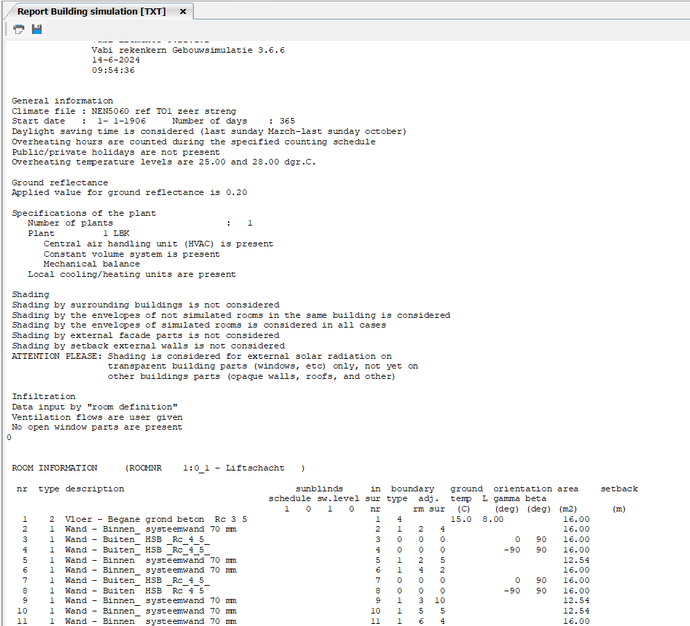
Similar to the MS Word report, the text report contains the results of various calculations. These text reports are almost identical to the reports you are used to from Vabi Uniform Environment.
You can print the report. When you click the button, a Windows Print dialog box will appear, allowing you to select the printer where you want to print the report.
Save as PDF
You can export the report to a PDF file. When you click the button, a Windows Explorer window will appear, allowing you to specify the location where you want to save the report.